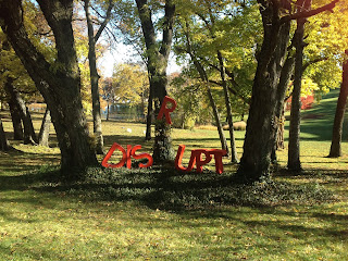
This was very first installation for our word. We decided to "disrupt" nature with our giant red letters and put them in this beautiful park area. We were able to hang the "R" in the tree with just some branches to "disrupt" the word. The lighting and day was also perfect for our pictures. The red stood out well against the green grass and foliage. So we are very proud of this turn out.
Thursday, November 21, 2013
Class Hall Installation
This was our first idea for our photo essays that were take for our photo books. We had to find places to put our word that would describe our word. So we found a big hall on campus and before a class we set our letters up as so it would look as if we were disrupting a class. The outcome we loved. And it was only one of our great ideas we used.
What Does Language Look Like Project Description
This
project is called What Language Looks Like, and the basis of this project is
taking a word and describing its definition with a picture of the words in
giant letters. At the beginning of this project we were given a list of words
and we had to pick one, then print out sheets with the word on them. We then
had to cut out the words and make 20 different ways of describing the word with
just shapes that we cut out. After doing 20 of those, the class critiqued them
and chose the top 5. We then had to take those 5, turn then into computer
generated versions and then make 10 more version but on the computer as well.
They were all critiqued again by the class, top 5 were picked, and then after
those were edited again those became the finals printed on Epson and pasted on
matte board. During this we were also put into groups of four, and given a
word. We took letters from this word to help pick our font and style and made
mini cardboard letters. After that we decided on a font style, then and to take
pictures that could be an environment that our word could be used in. We then
chose the best to use as our installation and photo essay. Using two different locations to put our word
that would basically describe our word.
Parts of a Letter Reflection
When
I read this I was surprised on how many different parts of the “letter” there
are. I had never thought about how crossbar, or vertex, or apex had ever been a
name let alone was important part of how a font looks. Nor did I know that
certain letters, such as “x”, were not always the same size as the rest of the
letters that were the same point as them. It sometimes goes above the line that
all the other letters will just touch. This is called the x-point. Same with
“p”s and “c”s, they will sometimes dip below the baseline that other letters
just sit on. This all just depends on the type of font used that the degree of
this is. And really every letter has a little quirk similar that we never
notice when they are used everyday. It was very interesting to learn that every
part of a letter, no matter the font, as a name and all of these little details
are what make a font unique. Logos are also based on these little things that
make a font. The company logo “FedEx” was used as an example because the big part
that makes their logo unique is that the “Ex” forms an arrow when the two
letters are pushed together and that all has to do with the font and how it’s
placed together.
Photography Essay
Digital cameras have
changed the way photos are taken forever and also how possible it is to be
creative with them. It is possible now to take a 100 continuous shots and all
you have to do is delete them if they don’t live up to expectation. There are
now important aspects of photography that have developed with the digital
camera; symmetry, asymmetry, repetition, framing, close-ups, continuous mode,
exploration, movement, serendipity. Some of these are fairly self-explanatory,
and some have probably didn’t develop with digital photography, just became
easier to do or can now be done differently and given a different effect. Such
as symmetry/asymmetry and repetition, they are not new concepts but can be
taken to new levels with the digital effects, unlike the continuous mode that
is something that came with the digital camera that can be a really unique tool
to use to take a great shot. Same as movement, where flash and shutter speed
can be used to get different effects and photos than before. Overall more levels
can be achieved with the digital photography. This was helpful toward our
project because since we have to take different photos with our 3-D word, it
was helpful to think of all the different affects we could use to make the
photo more interesting and unique, different things we could try. They were
definitely some good things to remember while taking our pictures or
brainstorming ideas to have our pictures taken.
Construction of our final letters
This is part of our process of building our giant 3 feet letters. We built them out of cardboard, put together with an industrial hot glue gun which worked wonders. After getting a routine down they went together smoothly. Our word was "disrupt" so to define the word we decided to paint them a bright, firetruck red, which would stand out and "disrupt" in almost any situation.
3 in. model letters
Before we made our final 3 ft. cardboard letters, all four girls in our group were assigned a type of a font chosen by us and had to build 3 in models to compare them and see which one we liked the best and would work best for our ideas.
Final 5 Conquer Constructions
These are the final five constructions of the word conquer that I did. There were made on Illustrator instead of hand constructed and were printed on epson paper and pasted on matte board. They are 6 in by 6 in on a 10 by 10 matte board. These were chosen and critiqued by the class and refined by me. My personal favorite is the one right below (second one down).
Thursday, October 31, 2013
CONQUER: Word Description Assignment
This part of the project we had to pick a word off a list and then in a 6x6 square take the word, my was "conquer", and use it to describe what it means.
Rules: only black and white, cannot be too illustrative, can only use the words that are printed from the class site, and cannot use the word more than once within the composition.
Originally we had to come up with 20 different ideas, cutting the words out of paper, and cutting out black backgrounds or whatever shape wanted. After making those 20, we were critiqued and the top 5 were chosen by the class. We then had to make any changes needed to those and make 10 more different ones. But these were made on the computer instead, with Adobe Illustrator to be exact. Those were then brought to class and critiqued again, the best five moving to the next round. Those five were critiqued, fixed and brought back as finals printed on epson paper and a 10x10 matte board.
Coco Chanel
Coco Chanel
was born August 19 1883 and lived until January 10 1971. Her real name is
Gabrielle Bonheur Chanel. Her accomplishments include revolutionizing the woman’s
black suit and the little black dress. These designs are still popular and used
everyday. She also was famous for other jewelry, purses, and the famous Chanel
No. 5, which is also still very popular today, and this was the first time a
name was used in a perfume brand. She had a very sophisticated style and became
iconic for it with her suits and pearl necklaces that she constantly wore.
Although she
was not just born into the fashion world, she had a brief career as a singer,
which is where she got the nickname Coco. And she met two men that helped her
into the fashion world and supported her original business. Her business
originated from when she made a dress out of a jersey one chilly day and many
people asked where she had got it, so she offered to make them one. And the rest
is history.
My costume as Coco was based of her legendary black women's suit. So I wore a black blazer, black pencil skirt, and a chained necklace where the design is also a timeless Coco design(Ignore the Keds, not part of costume).
Thursday, October 17, 2013
Original Make It Better Poster
This is our original poster we had. We is just not pretty. We had put this together with all our stuff just throwing out ideas and we realized we had to present this to the class so this was our first poster. It is very elementary and we knew that. It is too symmetrical and doesn't focus on our final prototype enough. Our final was a great improvement.
Make It Better Poster
This was our final poster design for our Make It Better project. This poster was a little tricky because of all the text and trying to highlight certain aspects of it such as our final prototype and hiding other aspects such my group and I's name. We were required to also include our concept statement over our prototype which was also tricky because of the length of it. But this was the product of all this work, and if I'm being honest I don't LOVE it but it looks much better than our original which I will post next. It does it's job though and I'm satisfied with that.
Understanding Comics Reflection
A lot of different types of drawn objects are used as icons. There are different types of icons such as pictorial icons which are fairly realistic, then there
are more simplified icons. Cartooning is an example of simplifying a picture.
It doesn’t really take away the details of an object but focuses on specific ones.
Most people looked cartoons as a child and even when they are older and the
reason is that we see ourselves in the simple features of a cartoon face. The fea-
tures are so vague that we are able to put ourselves into that cartoon character.
We do the same with inanimate objects. We become almost “part of them” or it
becomes “part of us” while we use them. Such as driving a car or using crutches
we are able to use these things and we subconsciously consider them extensions
of our bodies. We also tend to make faces out of almost any shape because of
how we see ourselves. But with these simple characters if usually a more
detailed background.
Pictures can also show emotion or senses. They can give a picture or
even object in the picture a certain feel. This is called expressionism. Lines,
thickness or shape, color, testures all have adifferent meaning and add to the
feeling of the picture. Written words can also add to the atmosphere of a picutre
a lot.
Objectified Reflection
This was a very cool film because
for once you were able to see the designers behind the everyday items that we
use and take for granted, that are actually genius designs we just don’t notice
them. Design is truly used everywhere, as they point out, and almost everything
was designed by man.
It was very cool to see the
designers of popular products such as Apple. And he made a good point of saying
that although a design is simple and doesn’t look like it took much work, such
as all of the sleek Apple products, lots and lots of brainstorming and
processing has gone into that product. That just really made me think about all
my everyday possessions that I never thought of someone taking the time to design,
brainstorms, and work out the kinks. Now everywhere I go I see design and what
kind of work that designer put into that object.
Subscribe to:
Posts (Atom)