Thursday, January 29, 2015

Cereal Box Design Advancements

Most of these designs were based on previous designs and I have just advanced them or tweaked them a little bit. But some of them are completely new, or a spin off of another. The templates are kept the same, with the far left being the front of the box, and the far right being the back. The first three are all spins offs of other designs. The first, yellow one I changed the typefaces from the original, tweaking the sizing and spacing so they fit together a little bit better. I wanted to give the impression of almost a puzzle of how "RI" and "CE" fit into "krispies".  Then chose soft, but bright colors that give a friendly, happy impression. The last two both use my scan of my handwritten "krispies". On the bottom I kept it simple, just enlarging the scan, but on the middle I wanted to get a little more messy and hectic. I changed the colors, making a three color pallet, but not too overwhelming.

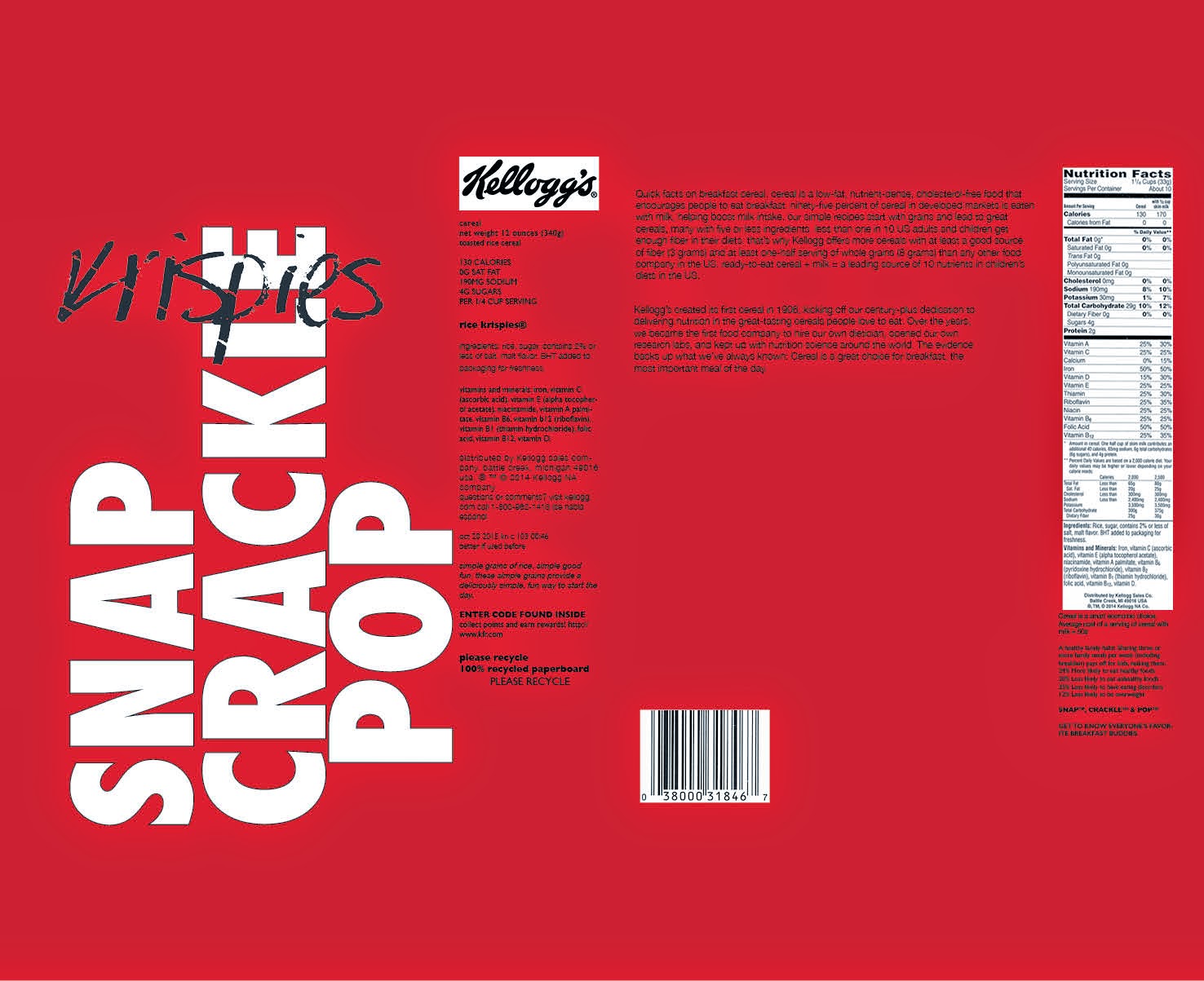
The next few are all different in color schemes and designs. The first I made the logo very geometric, basing it off of a box-shape. The two words different colors as to make it more legible. But using the same color scheme as the first above. The second I used a lot of repetition and a gradient of text. It also jumps out at you, but I don't find it being too much. I kept to the simple black, white, and gray color scheme, but I could change it if I wanted to further advance. The last is a completely new idea, I used a red background as to really pop out. And keeping with the "krispies" in my handwritten scan. I imagined the "SNAP CRACKLE POP" as being cut out, and able to see the cereal inside the box. 


The last two are based on other ideas, shown previously. I really played with repetition and have a lower opacity. Making the text stand out but also using it as a background. 


Tuesday, January 27, 2015

Explorations of Cereal Box Designs

Our first assignment this semester is to redesign a cereal box, with a focus on the use of text and the ways it can expressing meaning and emotion. My explorations began as all compute- generated. Here are a few examples: 
The large template shown is the entire template of the cereal box. I used this so I could get a feel of how it would look with my design and size for the design. So that is I wanted to wrap text around the box or anything I would be able to visualize it easier. So, I started off with very basic, quick text. Just playing with different fonts, getting a feel for each, how they make me respond. The first four represent that. Very simple fonts, maybe using two, and their location on the box is similar throughout them all, quiet and easy. I didn't use any color immediately, only focusing on design, adding color later if needed. 


The next several concepts I played more with the placing, sizing, and orientation of the fonts. I really like taking the shape of the letters, and putting other words or letters in the spaces they make. I stay fairly geometric with my placing, not really causing any organic shapes. And again, still not using color. 


The last few are my favorites and most developed. In the last I finally added some color. I also played with reflections and repetition. The colored "krispies" on the last is a edited copy of my own handwritting. I wanted to explore a more physical dimension of these concepts. And so far that one is my favorite and I will develop more off of it. 

Thursday, January 22, 2015

David Carson

After watching David Carson's Ted Talk, one of the first important points he makes is that type can represent emotion and sophistication. His example, a "No Parking" sign and "No Parking" hastenly written in graffiti, proves this point; showing which is more effective and convincing. This is an important, vital part of typography and graphic design. Type can control how messages are communicated and their importance. The emotional response that a viewer gets from seeing design is very important to him he says, but I think it is important in design all around. One quote that Carson talks about is " Don't mistake legibility for communication". I really love this, typography can be giving two different messages by just its design and fonts. Design needs to be deeper that just what the words are saying.
Here are some examples of David Carson's work.