- Multiple column grids can be helpful in using hierarchy, making some bigger than others, and making certain parts of text more important or stand out. I can also give ways to place text and pictures together, and where to leave empty space.
- Optimal line length for text is usually 50-70 characters, including spaces. If it is too long the reader will have a hard time focusing on text, if too short the reader has to travel back and forth too often and can loose place more easily.
- The baseline grid is used to anchor most or all information on a page. It keeps the layout similar and balanced.
- Sometimes justified text will look much cleaner and work better with the layout design, but correct justification is hard to achieve. Often, the words are too spread out throughout each line, or are too crammed. But these flaws can be tweaked as to not cause that and not be such an eye sore on the page.
- Typographic river is when word spacing between multiple lines line up together, causing a "white river" to run down the text. Can be cause be too much spacing between words.
- Hang line design is where there is an open section left at the top of the page, left for either pictures or text, maybe even just open space. Again, keeping the page balanced and organized.
- There are a couple ways to indicate the start of a new paragraph. One, is the indention of the first line. Another, is an extra, blank line in-between paragraphs. Outdenting at the end of the paragraph, or maybe using a symbol.
Monday, November 17, 2014
Typography and Layouts
Sunday, November 16, 2014
.jpg)


Mario Testino
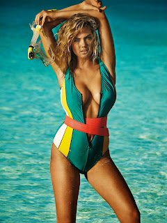
For my final project I have chosen the famous, high fashion photographer Mario Testino. Testino takes beautiful photos for not only famous fashion companies such as Gucci, Versace, and Dolce & Gabbana, but his constantly working for magazines such as Vogue and Vanity Fair.
After studying his work I have found several words that could be used to describe his photography style:
After studying his work I have found several words that could be used to describe his photography style:
·
Energetic
·
Beauty
·
Dramatic
·
Colorful
·
Expressive
·
Celebrities
·
High fashion
·
Timeless
·
Random
·
Composed
My favorites from this list are energetic, expressive, dramatic, and beauty. All of which, are main points in all of his photos, used some way or another.
Wednesday, November 12, 2014
Mario Testino
Mario Testino was born in Peru in 1954, but began his career as a photographer after he moved to London in 1976. He began with taking portraits, making his first break into Vogue in 1983 and has been hired by many famous magazines since. In 2010, he was awarded The Grand Cross Order of Merit
in Peru, which is the highest award in his country. He has photographed many celebrities including the Royal family, starting with Princess Diana, Cara Delevingne, and Kate Moss just to name a few. He has published several books, many exhibitions, and has worked all over the world.


Photos by Mario Testino


Monday, November 10, 2014
Font Study: Rockwell
For this project I chose to research and study the font Rockwell. Taking all the information I had found I made a final poster set, one poster showing different characteristics of the font, the other with information about the history of the font and the type designer who created my font. The finishing by making an animated gif about a few important characteristics of the font


Some of my process:


Tuesday, November 4, 2014
Six Designes Mentioned by Neville Brody
Gerard Unger
Gerard Unger is a graphic designer and typographer who has designed stamps, coins, magaines, newspapers, books, logos, corporate identities, annual reports, and many typesfaces. He was born in Arnhem, Netherlands and studied graphic design, typography, and type design at Gerrit Rietveld Academy, in Amsterdam, and then later became a professor there until January of 2007. He now teaches at the University of Reading, UK. He has recied the H.N.Werkman-Prize, Gravisie-Prize, Maurits Exschede-Prize, and Sota Award.
Barry Deck
Barry Deck is a typeface and graphic designer,
know to work with distorted typefaces, and working with Pepsi, Reebok,
Nickelodeon, and VH1. He was born in Mount Pleasant, Iowa. He graduated from
Northern Illinois Uniersity and went to work for Lipmon & Simmons in
Chicago in 1986 as a junior designer. Shortly after he worked as a graphic
designer fro Kim Abrams Design. In 1987 he enrolled at the California Institute
of Arts. Then moving to New York in 1992.
Paul Elliman
Paull Elliman is
a self-taught designer. He has taught at many universities including Central
St. Martins School of At, the University of East London, Univeristy of Texas at
Austin, and School of Art at Yale University, New Haven. He works with a range
of people, such as; product and graphic designers, engineers, architects, and
cycling activists. He also has a magazine column in IDEA magazine.
Rick Vermeulen
Rick
Vermeulen is a graphic designer, born in Schiedam, the Netherlands in 1950. He
studied graphic design at the Rotterdam Academy until 1972, and then landed a
job working for Bert Bakker, a publisher. He then worked as editor of Hard Werken
Magazine, along with four other men, making an impact on the nation. The group
of five then formed a design studio name Hard Werken. In 1994, the studio being
in financial trouble, moved to Amsterdam and joined forces with a packaging
design company Ten Cate Bergmans, changing their name to Inizio. He then moved
to the US and taught at Canbrook, Cal Arts, and North Carolina State Unveristy.
He moved to Los Angeles for two years, then moving back to the Netherlands.
Phil Bicker
Phil Bicker is known as a creative director,
designer, and photo editor. He made careers in editorial, advertising, fashion
and an art director. He started as an art director at The Face in London, then
directed Creative Camera Magazine, Vogue Hommes International, where he
encouraged fine art photographers to create fashion stories. He has worked for
well-known companies such as Clavin Klein, BBH, and The Fader. He finished his
career working between Magnum Photos and Time Magazine.
Tobias Frere-Jonas
Tobias Frere-Jonas was born in New York in
1970. He was born into a family of writers and printers, so naturally became a
designer of typefaces. At age 14 he was already exhibiting paintings, sculptures,
and photos in New York galleries. He attended Rhode Island Schoo of Design, and
graduated in 1992. He got a job at Font Bureau, and was a senior designer there
for several years. He created three fonts with them, reactor, Fibonacci, and
Microphone. He then taught at Yale University of Art to teach a typeface design
class, but in 1999 returned to New York. He was awarded with the Gerrit
Noordzij prize in 2006 and AIGA medal for exceptional achievements in the field
of design in 2013.
Subscribe to:
Comments (Atom)